

.png)
.png)
.png)
.png)
.png)
.png)

TikTok
Problem
Because TikTok is a fairly new application, we saw much potential for improvement.
TikTok has become one of the most downloaded apps, especially since COVID-19 forced us into quarantine over the past year. Personally, while using TikTok, we have had trouble learning the various features and found the app overwhelming at times. Tik Tok also has a large user base that expands across generations and countries worldwide; thus, we believe a redesign could make the app easier to use, especially for new users.
The Solution
The main component we chose to redesign is the sharing feature on TikTok. By doing this, we also want to encourage in-app sharing because, from a business perspective, TikTok would benefit from more engagement if users stayed on the app longer.


Competitive Analysis
Competitors offer Group Messaging
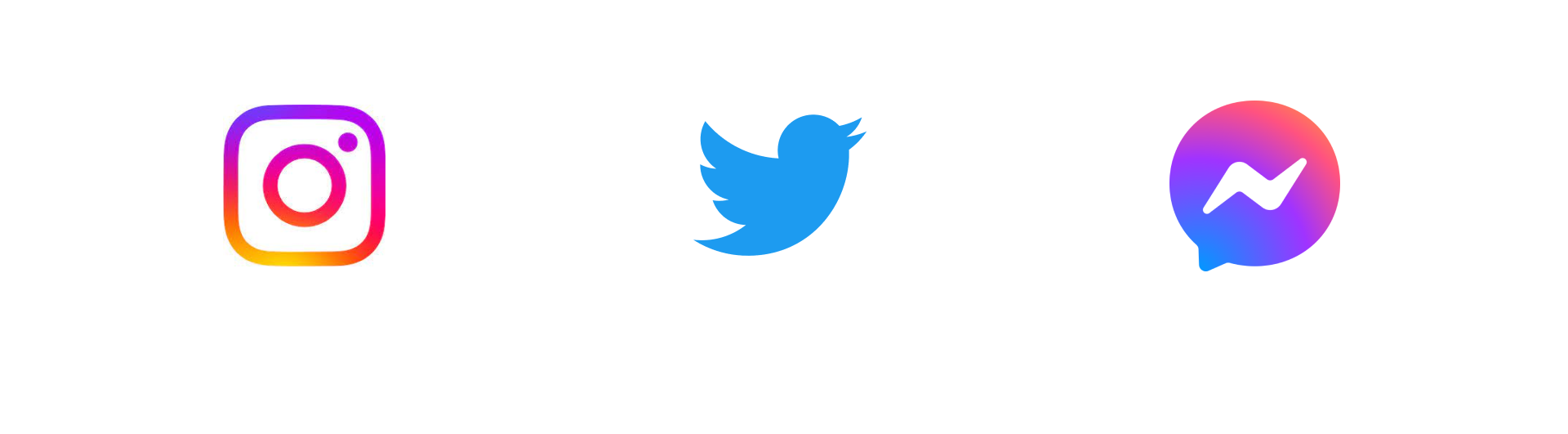
For each post, Instagram has a share button linked directly to searching for a recipient or quickly selecting one of your recent messages; once selected, you can customize your message. The sharing function is very clear, giving users a choice to share a story with friends. Instagram also allows group-sharing, letting the user search right away for different friends or existing group chats.
Twitter only allows users to share posts that are public. The user must click on the icon at the bottom right of the post to access the sharing page. When clicking on the icon, it gives users a pop-up with an option to send it through a DM while also being able to share it in other ways. This popup displays the options similarly to TikTok. When choosing to send it through a DM, Twitter allows users to send it individually or to a group by creating a new group, a feature that TikTok lacks.
FB MESSENGER
Facebook also has a share button at each post’s button; when clicked, it gives the user options on where to share: on their feed, in messenger, on a page, in a group, or other options. These sharing options are listed in a vertical listing format, with sharing to feed is the most obvious function. However, in the context of TikTok, sharing through DMs would be the main goal. Though the options are listed, there are too many options. For example, a user might get confused between “messenger,” “page,” and “group.” FB allows users to create a new group when sharing or sharing with an existing group. There is also a clear distinction between groups and individuals to prevent error.
User Interviews
Users’ mental models are inconsistent across the board regarding what “sharing a TikTok” means.
Upon interviewing multiple users, a common pain point was getting frustrated trying to respond to multiple TikToks. They had to send a general response or over-described TikTok.
Insights
Simplify Sharing With Group Chats.
Based on the trend in our research, our team could deduce the main features users are looking for.
- Low discoverability when wanting to send a TikTok to a featured person.
- Lastly, sending a group message isn’t possible – you can only send the TikTok to multiple people in individual messages.
Paper Wireframes

Final Design

Conclusion & Lessons Learned
Applications for future projects.
In summary, the users agreed that the current “share” screen is too crowded and appreciated that our redesign put all actions unrelated to sharing (i.e. save video, add to favorites, report, duet, etc) under a “more” button.
The users resonated more with the “share” screen from Prototype B because it closely resembles the existing “share” screen on TikTok but is less cluttered.
When sending a TikTok to a group, users had more support for the flow in Prototype A because it was easier to follow and did not contain any unnecessary steps (such as naming the group or confirmation).
However, the plus button to create a group was hard to find in Prototype A. These insights will be considered if we choose to continue this project in the future.


